
Pastel color is known as one of the most attractive and pleasant colors in the world of art and design. These colors, with their special characteristics, convey the feeling of calmness and tenderness to the viewer. Pastel colors usually include soft and pale colors, which, due to the combination with white colors, achieve more softness and lightness. Pastel colors in interior design, fashion, and visual arts help to create a pleasant and calm atmosphere. These colors are especially popular in spring and summer and can be seen as a symbol of freshness and new life. In this article, we discuss the psychological effects of pastel colors and the use of pastel colors in the construction paint industry and their artistic and industrial uses.
What is a pastel color? How is it made?
Pastel colors, with their inherent elegance and calmness, play an important role in the construction paint industry as well as in the artistic and industrial fields. These colors, which are diluted and soft versions of the original colors, are created by adding a lot of white to the pure colors, instilling a sense of softness and relaxation.
In other words, pastel color refers to colors that have less intensity and concentration than the main colors and are usually obtained by combining the main colors with white. Due to their softness and tenderness, these colors convey a feeling of calmness and pleasantness to the viewer. They usually include soft colors such as pink, blue, green, yellow and purple.
How are they made?
- Choosing the main color: First, a main color is selected. This color can be any color, such as red, blue or yellow.
- Adding white color: To create a pastel color, the main color is mixed with white color. This work reduces the intensity of the color and creates softness in the color.
- Adjusting the ratios: The ratio of the main color to the white color can be different. The higher the amount of white, the brighter and softer the pastel color will be.
- Experiment and refine: You may need to experiment and refine the proportions to achieve the desired color.
Pastel colors are used in interior design, fashion, visual arts and even in product packaging. These colors are very popular in different spaces, especially in children’s and relaxing spaces, because of their attractiveness and relaxation.
Combination of pastel colors:
– Pastel colors blend well with each other
– They can be combined with neutral colors such as white, gray, or beige
– To create contrast, you can use darker colors next to them
Use of pastel colors
Pastel colors are used in various fields, including:
– Interior decoration
– Fashion and clothing
– Art and painting
– Graphic design
Seasonality:
– Pastel colors are often associated with spring and summer
– In fashion and decoration, they are usually seen more in these seasons
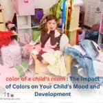
Due to their relaxing properties, these colors are very popular in spaces such as children’s rooms, beauty salons, and medical centers.

Pastel colors in the construction paint industry
This product is widely used in the interior and exterior design of the building.
1) Application in building interior design:
Pastel colors are very popular in interior design. These colors are used in interior spaces due to the following features:
– Creating a calm and pleasant atmosphere: pastel colors reduce stress and increase the feeling of peace in the space.
– Increasing brightness: these colors make small spaces appear bigger and brighter due to their bright nature.
Flexibility in combination: pastel colors are easily combined with each other and with neutral colors.
– Suitable for special spaces: They are widely used in children’s rooms, bedrooms, and rest spaces.
2) Application in the exterior of the building:
Pastel colors are also used in the exterior of buildings:
– Creating a calm urban environment: using these colors in the facade of the building can help create a calm and pleasant urban environment.
– Resistance to sunlight: Some pastel colors have good resistance to direct sunlight.
– Harmony with the environment: these colors can create a good harmony with the surrounding natural environment.
3) Construction pastel color production technology:
The construction paint industry uses advanced technologies to produce high-quality pastel paint:
– Use of quality pigments: To create stable pastel colors, high-quality pigments are used.
– Nanotechnology: Some manufacturers use nanotechnology to improve the durability and resistance of pastel colors.
– Environmentally friendly formulation: Nowadays, efforts are being made to produce pastel colors with environmentally friendly formulations.
Pastel colors in art
It is interesting to know that pastel colors are used in painting, photography, and graphic design.
a) painting:
Pastel colors have a special place in the art of painting:
– History: The use of pastel color in painting dates back to the 18th century.
– Impressionism: Impressionist painters like Monet and Renoir used pastel colors to create their works.
– Painting techniques: In oil, watercolor and acrylic painting, there are special techniques for creating pastel colors.
– Contemporary art: Even today, many contemporary artists use pastel colors in their works.
b) Photography:
Pastel colors are also widely used in photography:
– Fashion photography: In fashion photography, pastel colors are used to create a sense of softness and elegance.
– Portrait photography: these colors are used in portrait photography to create a sense of calmness and beauty.
– Post-processing: In the post-processing stage of photos, there are special techniques to create pastel effects.
c) graphic design:
In the field of graphic design, pastel colors have various uses:
– Logo design: For brands related to children, health or beauty, pastel color is often used in logo design.
– Web design: pastel colors are used in the design of friendly and non-aggressive user interfaces.
– Packaging: Pastel colors are used in the design of product packaging, especially in the cosmetics industry.
Application in art:
Impressionists like Monet and Renoir used pastel colors to create works of art
– They are still popular in modern and contemporary art

Pastel colors in the industry
This amazing color is found in abundance in fashion and clothing, home appliances, and cosmetics industry.
A) fashion and clothing industry:
Pastel colors are very popular in the fashion and clothing industry:
– Seasonal trends: These colors are often associated with spring and summer.
– Dress design: Pastel colors are used in the design of formal dresses, wedding dresses, and children’s dresses.
– Accessories: these colors are also used in the design of accessories such as bags, shoes, and jewelry.
b) Household appliance industry:
Pastel colors are also used in the design and production of household appliances:
– Kitchen appliances: Pastel colors are used in the design of electric kitchen appliances such as microwaves, toasters, and electric kettles.
– Furniture: These colors are used in the design of furniture, especially for children’s and teenagers’ spaces.
– Decoration: In the production of decorative items such as cushions, curtains, and carpets, pastel colors are very popular.
c) Health and cosmetic industries:
Pastel colors are widely used in health and cosmetic industries:
– Product packaging: pastel colors are often used in the design of packaging for cosmetics and health products.
– Product color: some cosmetic products such as lipstick, eye shadow, and nail polish are produced in pastel colors.
Challenges and future of pastel colors
Despite the popularity of pastel colors, there are some challenges in using them:
– Sensitivity to pollution: Because pastel colors are bright, they may get dirty quickly in dusty environments.
– Need for maintenance: in some cases, maintenance of surfaces painted with pastel colors may be more difficult.
– Limitation in some environments: In official and professional environments, the use of pastel colors may not be suitable.
However, the future of pastel colors in the paint industry and its artistic and industrial applications seems bright. Technological advances in color production increased attention to relaxing and eco-friendly designs, and consumers’ desire for calm and pleasant spaces can all contribute to the continued popularity of pastel colors.

Advantages of pastel colors in the paint industry
If you want to know about the benefits of this beautiful product, read the following.
1. Visual appeal:
– Creating a calm and pleasant atmosphere
– A soft and delicate appearance that is attractive to many consumers
2. Variety of applications:
– Can be used in a wide range of spaces, including residential, commercial and office
– Suitable for indoor and outdoor spaces of the building
3. Composability:
– They are easily combined with other colors
– The possibility of creating diverse and coordinated designs
4. Illumination and magnification of the space:
– Helping to make small spaces look brighter and bigger
5. Compatibility with design trends:
– Coordination with modern and minimalist style
– Popularity in contemporary interior design
6. Positive psychological effects:
– Creating a sense of peace and comfort
– Reducing stress in the environment
Disadvantages of pastel colors in the paint industry
This paint, like all industrial materials, also faces shortcomings.
1. Sensitivity to pollution and stains:
– Because they are bright, pollution and stains are more visible on them
– The need for more maintenance and cleaning
2. Production challenges:
– The need for high precision in the production process to achieve uniform colors
– Sensitivity to minor changes in formulation
3. Restrictions on coverage:
– Several layers of paint may be needed to completely cover dark surfaces
4. Sensitivity to light:
– Some pastel colors may fade under strong light
5. Restrictions in some environments:
– They may not be suitable for industrial or high-traffic spaces
– In some formal environments, they may seem too informal
6. Marketing challenges:
– Some customers may find them too soft or “childish”.
– The need for specific marketing strategies to attract different customers
7. Environmental issues:
– The production of some pastel pigments may create environmental challenges
– The need for research and development to produce more environmentally friendly pastel colors
8. Production cost:
– Some pigments required to produce high-quality pastel colors may be expensive
9. Limitations in covering surface defects:
– Because they are clear, they may be less effective in covering surface defects
10. Long-term maintenance challenges:
– They may need more color renewal over time
Despite these disadvantages, pastel colors are still popular in the paint industry, and manufacturers are trying to minimize these challenges by innovating and improving formulations.

Psychology of Pastel Colors
Pastel colors usually evoke positive emotions. They can reduce stress. increase comfort and comfort and revive the sense of nostalgia and childhood memories.
Challenge:
– Excessive use can make the space look soulless or childish
– They may not be suitable in some professional or official contexts
conclusion
Finally, pastel colors, with their combination of elegance, relaxation, and flexibility, will continue to have an important place in the construction paint industry, interior decoration, fashion and clothing, art and painting, and graphic design. With the ability to create calm and pleasant spaces, these colors play an important role in shaping our living and working environment. Today, many contemporary artists use pastel colors in their works of art. These beautiful colors have their own challenges and benefits.
Pastel colors have less intensity and saturation compared to primary colors and are usually obtained by mixing primary colors with white.

21 Responses
merci
https://daroosf.com/%D9%85%D9%88%D8%B2%D8%8C-%D9%85%DB%8C%D9%88%D9%87-%D8%B4%D9%85%D8%A7%D8%B1%D9%87-%DB%8C%DA%A9-%D9%88%D8%B1%D8%B2%D8%B4%DA%A9%D8%A7%D8%B1%D8%A7%D9%86-%D8%AC%D9%87%D8%A7%D9%86/
thanks
https://daroosf.com/%D9%85%D9%88%D8%B2%D8%8C-%D9%85%DB%8C%D9%88%D9%87-%D8%B4%D9%85%D8%A7%D8%B1%D9%87-%DB%8C%DA%A9-%D9%88%D8%B1%D8%B2%D8%B4%DA%A9%D8%A7%D8%B1%D8%A7%D9%86-%D8%AC%D9%87%D8%A7%D9%86/
sehr gut
https://daroosf.com/%D9%85%D9%88%D8%B2%D8%8C-%D9%85%DB%8C%D9%88%D9%87-%D8%B4%D9%85%D8%A7%D8%B1%D9%87-%DB%8C%DA%A9-%D9%88%D8%B1%D8%B2%D8%B4%DA%A9%D8%A7%D8%B1%D8%A7%D9%86-%D8%AC%D9%87%D8%A7%D9%86/
well done
https://daroosf.com/%D9%85%D9%88%D8%B2%D8%8C-%D9%85%DB%8C%D9%88%D9%87-%D8%B4%D9%85%D8%A7%D8%B1%D9%87-%DB%8C%DA%A9-%D9%88%D8%B1%D8%B2%D8%B4%DA%A9%D8%A7%D8%B1%D8%A7%D9%86-%D8%AC%D9%87%D8%A7%D9%86/
great
https://daroosf.com/%D9%85%D9%88%D8%B2%D8%8C-%D9%85%DB%8C%D9%88%D9%87-%D8%B4%D9%85%D8%A7%D8%B1%D9%87-%DB%8C%DA%A9-%D9%88%D8%B1%D8%B2%D8%B4%DA%A9%D8%A7%D8%B1%D8%A7%D9%86-%D8%AC%D9%87%D8%A7%D9%86/
oh my God
https://daroosf.com/%D9%85%D9%88%D8%B2%D8%8C-%D9%85%DB%8C%D9%88%D9%87-%D8%B4%D9%85%D8%A7%D8%B1%D9%87-%DB%8C%DA%A9-%D9%88%D8%B1%D8%B2%D8%B4%DA%A9%D8%A7%D8%B1%D8%A7%D9%86-%D8%AC%D9%87%D8%A7%D9%86/
Pastel colors offer a soft, pleasing aesthetic that can enhance the visual appeal of buildings, interiors, and exteriors. They create serene and inviting environments, making them ideal for residential spaces, schools, hospitals, and leisure facilities.
Pastel colors are often associated with calmness, tranquility, and positivity. Their use in construction and interior design can contribute to a more relaxed atmosphere, which is particularly beneficial in spaces like nurseries, healthcare facilities, and relaxation areas.
Pastels can easily complement a variety of design styles, from traditional to modern. They are often used as accent colors or in combination with more vibrant colors for a balanced look.
In recent years, there has been a shift towards softer color palettes in design trends. Pastel shades align well with current trends in minimalism and biophilic design, where nature-inspired colors and subtle hues are favored.
Market Trends: In recent years, there has been a shift towards softer color palettes in design trends. Pastel shades align well with current trends in minimalism and biophilic design, where nature-inspired colors and subtle hues are favored.
Pastel colors are very popular in design and decoration due to their special features.
Pastel colors are usually gentle and soft, which can create a sense of calm and tranquility in the space.
These colors usually have a beautiful and pleasant appearance that can easily match with other colors and patterns.
Pastel colors are used in various decoration styles, from modern to classic and rustic.
These colors can bring a pleasant and refreshing feeling to the desired space and create positive energy.
👍🏼👍🏼👍🏼
https://arefchemical.ir/%D8%B1%D9%86%DA%AF-%D9%87%D8%A7%DB%8C-%D8%A8%D9%87%D8%A7%D8%B1%DB%8C-2025/
pastel colors creating a calm and pleasant atmosphere
wonderful
They are sensitive to pollution and stains because they are bright
https://arefchemical.ir/%d8%b1%d9%86%da%af-%d9%86%d8%a6%d9%88%d9%86%db%8c-%da%86%db%8c%d8%b3%d8%aa/
✅✅✅✅✅